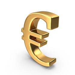
The painstaking story behind the euro symbol
How did the euro acquire the symbol by which it’s known around the world? The value of those euro coins left as a tip at the bistro, taverna or tapas bar has fluctuated in the 17 years since they went into circulation, as with all currencies. Where the euro differs is that its ultimate worth has always been more than just monetary. Indeed, it’s hard to think of another currency that comes minted with such lofty ambition and political idealism, and with the Brexit drama skittering onwards and internal tensions tugging, this remains truer than ever.
As one of the world’s newest currencies, the euro’s decades-long gestation and protracted birth have been meticulously documented. It’s a story of meetings, negotiations, treaties and yet more meetings, its cast comprised almost exclusively of politicians and civil servants. The kind of yarn, in other words, likely to set only the pulse of an economic historian racing. Altogether more mysterious – and contested – is how the euro acquired the sign by which it’s known around the world.
The new currency’s name was chosen in Madrid in 1995. Allegedly the suggestion of a Belgian teacher and Esperanto buff, “euro” triumphed over a string of other contenders, including the irresistibly Shakespearean “ducat”. A crucial consideration was that the name must be the same in all of Europe’s official languages, and uniformity was deemed vital for the sign that would represent it too.
Unlike older currency signs that have evolved organically over centuries, the euro sign was designed by committee. The brief comprised three key elements: it must be a highly recognisable symbol of Europe, it had to echo well-known existing currency symbols, and it needed to be aesthetically pleasing and simple to write by hand. It fell to European Commission staff to compile a list of more than 30 possible designs. These were then whittled down to 10 and submitted to the public. Two designs emerged ahead of the rest, and it was left to then President of the European Commission Jacques Santer and Yves-Thibault de Silguy, the commissioner in charge of economic and financial affairs, to choose between them.
When the selected symbol was unveiled in December 1996, it was applauded by the now defunct newspaper The European as being “precise and confident, like a post-modern pretzel”. Elsewhere, it caused confusion. A ‘C’ bisected by two horizontal bars? Well, no, it was actually inspired by the Greek letter epsilon. A reference to the cradle of European civilisation, it emphasised historical continuity – as the design of the banknotes themselves would do – while also evoking an ‘E’ for Europe. The classical connection came to seem decidedly ironic when, in 2010, Greece’s bailout crisis threatened the stability of the entire eurozone. Just as well those two parallel lines running through its centre signify stability.
Curiously, it’s now all but impossible to trace the symbol that was runner-up in the popularity contest. It must exist in a Brussels vault, but search online and it’s as if the euro symbol was ever-destined to take its current form. There’s a fog of vagueness surrounding the public consultation, too. How many EU citizens were consulted? And of which nationalities? As to the identities of the designers behind the winning image – an image that became globally recognisable overnight – there were allegedly four of them.
What is specified is the sign’s geometric construction. Proportions must be exact, with foreground and background colour tones also stipulated. When officials decided to patent it, the euro became the world’s first copyrighted currency sign. None of this pleased typographic experts, who were suddenly faced with incorporating a new typographical symbol, or glyph, into existing fonts. Computer applications struggled, too, resulting in conversion errors that frequently saw a question mark pop up in place of the required symbol.
The euro was introduced as a non-cash currency, for instance in electronic transfers, at midnight on 1 January 1999. In 2001, with 14.25 billion banknotes and 50 billion coins set to flood 11 member states the following year, two bizarre challenges emerged to the official EU narrative. The sign had already been criticised for its resemblance to the old logo of US electronics company Commodore, but British foreign exchange specialist Travelex went a step further. Claiming that it had been using a strikingly similar sign in correspondence between a subsidiary and its business partners since 1989, it sued the European Commission for trademark infringement. (The court eventually ruled in favour of the EC, leaving Travelex facing a hefty euro bill.)
Regardless of who really designed it, this symbol of Europe is in many ways exactly what the sign has become
Then, just a few months later, one Arthur Eisenmenger spoke out from his retirement home in southern Germany, claiming that it was he who’d created the symbol more than 25 years earlier, while working as chief graphic designer for what was then the European Economic Community. Eisenmenger is credited with supervising the creation of the star-ringed EU flag and the “CE” quality control mark for European consumer goods. He created the euro sign, he claimed, as an emblem for Europe in general. “I wasn’t thinking of the euro at the time, but just something that symbolised Europe,” he told The Guardian.
Regardless of who really designed it, this symbol of Europe is in many ways exactly what the sign has become. Along with the Union’s flag and Ode to Joy-based anthem, it’s transcended its practical purpose and emerged as an icon of the European project. Perhaps the ultimate proof of its success is this: with the versatility of a truly enduring symbol, it can now even be spotted on pro-Brexit placards.