Why people are upset over Portugal’s new logo
A new party is in power in Portugal, and the first thing it did was change the official government logo.
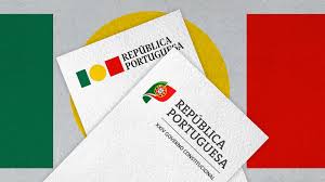
The country’s new government under Prime Minister Luís Montenegro, a member of the conservative Social Democratic Party, scrapped a modern state emblem that was designed last year and replaced it with an old logo that includes Portugal’s longtime national coat of arms.
Cabinet Minister Antonio Leitao Amaro said the coat of arms—which includes symbols referencing a 1139 battle between forces under Portugal’s first king Alfonso and the Moors—was “essential to our identity, our history and culture,” during a press conference, according to Reuters.
Just last year, the previous government had designed a more modern state emblem. Designer and educator Eduardo Aires designed a geometric logo that used simple shapes and colors inspired by the Portuguese flag. A yellow circle, representing a coat of arms, sits in between a green rectangle and a red square. The emblem was “designed to be more dynamic and operative in a digital environment, integrating all the graphic elements necessary to be applied at any scale and on any medium,” according to the studio.
It seems that the recent logo switch up has not gone over well with many in Portugal, including thousands of people who have signed an online petition, according to the Portugal Resident, an English-language news outlet in Portugal. But it’s little surprise.
In tense political moments, design can serve as a tangible extension of ideology. We’ve seen a similar dynamic in the U.S. during fights over state flag redesigns. In Utah, for example, a Republicans led an effort to shoot down a new, simplified flag design calling the redesign “woke.” In Minnesota, the state flag’s crowdsourced design also drew plenty of opinions.
While designers might view these redesigns as an apolitical tool for better, clearer communication, it’s clear that just about anything can be twisted into a political tool.